Hello.
Bienvenue.
Welcome.
If anything was a long time coming, it was this site. I don’t know if there is a more difficult problem to solve than designing for one’s self. This is actually the fourth version (yes, fourth) and is much departed from it’s ancestors. It has been in the works for a couple years now, since my graduation from Coastal Carolina University and has suffered delays and neglect from the days, weeks and months of a busy and often demanding schedule. But finally, something is ready to launch – so welcome to the new space.
The basic concept of the design is to use simple typographic and graphical elements on a grid structure to support the variety of content. Considering and supporting content is the goal of any design solution, and hopefully this site’s design steps aside and promotes the content.
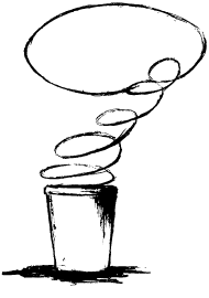
The brand elements on this site have evolved alongside the iterations of the site. The Univers type family, designed by Adrian Frutiger, is used for the logo. I am a fan of minimalistic design, so Univers was an excellent fit. The block in the logo represents the fundamental of what drives my creativity – I like to build things. It started out as a kid with Lincoln Logs and Legos and now shows in the building of websites, brands and the shaping of visual space. The coffee cup/thought bubble sketch was a quick idea for a Print magazine student cover design contest in undergrad. I liked it so much that I have never been able to leave it alone. I love a good cup of coffee and being thoughtful, so it was only natural to maintain this as a brand element. It is a scan of the original sketch, any attempts to refine it have lost the essence of the original moment.
Well, that’s enough for an introduction. Feel free to have a look around.
Enjoy,
-Jeremy